


Accessible Growth
Working on accessibility and help you reach your bottom line - heres how

In my everyday work, I'm part of a growth team, and my main goal is to help my company get more paying customers. You might be wondering, "How does accessibility or inclusive design connect to growing a business’s bottom line?" Well, I'm here to explain. The facts are pretty clear - there's a business opportunity here.
Red–green color blindness affects up to 1 in 12 males (8%) and 1 in 200 females (0.5%)
1 in 5 individuals in the United States have learning and attention issues
More stats on disability in the United States here
and I could go on!
All this data shows that many people can benefit from designs that are accessible and inclusive. These people are consumers, they our friends, loved ones and they're looking for solutions. If you can help them, they're more likely to use and pay for your service. But if you ignore their needs, they won't. It's that simple.
In my career I have done a few accessibility projects that increased growth with great results, here are some of those examples.
1. Supporting Both Portrait and Landscape Views:
I've worked on a few apps in my career, including upsell and checkout pages. Ensuring that in-app purchase pages function seamlessly and maintain an attractive appearance in both portrait and landscape modes has consistently led to an increase in successful purchases (which translates to more revenue). Assisting users in completing tasks in the way that is most comfortable for them not only aids them in accomplishing those tasks, such as making a purchase, but also fosters trust. Some users require landscape mode to read larger text or to interact with larger touch targets, like buttons or drop downs.

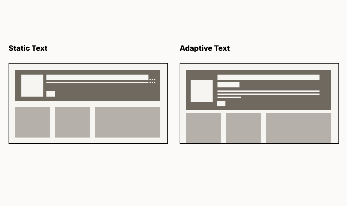
2. Web pages that supported various text sizes & lengths
These days, phones, computers, and browsers all allow you to adjust things like text size, font weight, and even font style. When you let text wrap and support larger text sizes, your page will have higher engagement rates than pages that don't adapt. Consider users who may have their text size set to larger than what your design might have accounted for. If you simply cut off or truncate text, these users will face more difficulty using your product compared to those who keep default settings.
Warning Users About Long Processes and Timeouts
"Sign up," "sign in," and particularly onboarding flows (which many growth designers work on) can be quite long, such as setting up a bank account or buying insurance. We do this to get an accurate picture of our users and, eventually, personalize their experience. When a flow is lengthy, it can mean users will need to pause and access information from other sources to complete the process, like their account number or credit card information. Automatically timing them out can lead to unnecessary friction and frustration. Providing a warning and alerting them before pages time out can help users ensure they are still active. In my experience, this practice has improved longer onboarding or setup flows and increased conversion rates because users won't get unexpectedly logged out.

Simple accessibility improvements to your product can really make the difference between helping and frustrating users, especially in flows that growth teams work on, such as onboarding or checkout. We aim to ensure that everyone can successfully complete these flows to fuel the growth of our product. If your product doesn't currently meet WCAG standards, read through them carefully and create a library of improvements to add and experiment with. These straightforward changes can have a significant impact on both your customers and your bottom line.
This one is soooo good!